Below the Report data you can find the Chart and Chart editor. Chart information is strictly related to Report data above and Report settings, such as Filters, Aggregates and Groups. This means that every time you change the Report settings in the Report Editor, you need to Save those settings in order to be able to see them changed accordingly in the Chart Editor before adjusting the Chart Settings.
In the Chart Editor you can identify the chart type and other chart settings. After changing the chart settings, click on Preview button inside Chart editor to see the new look of the chart. Changed chart settings are saved only after you save the Report.
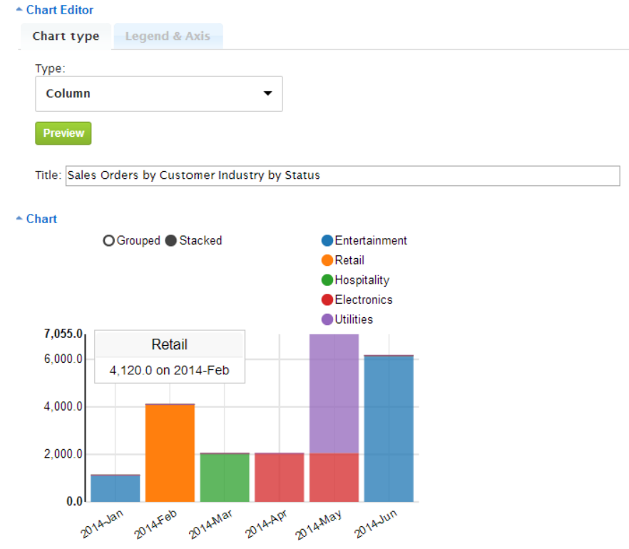
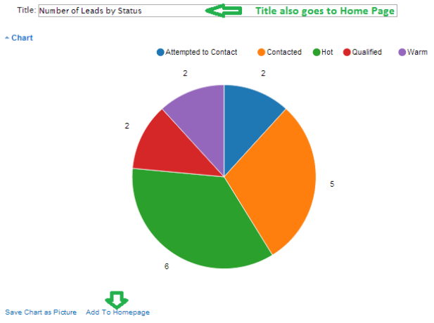
In the Title area you can enter the Chart title. Hovering or clicking on the colored chart area will display the data represented by this area:
Clicking on the chart legend will hide/show the data.
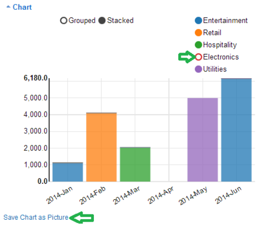
Click the Save Chart as Picture link below the chart to save the Chart as a PNG format picture.
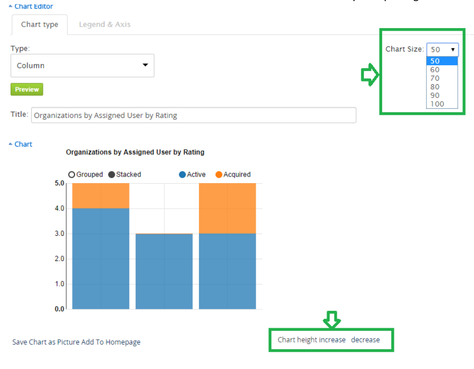
You can enlarge the entire chart by selecting pre-defined sizes from the drop-down menu in the top-right corner of the chart. If you need to increase/decrease the chart height only, you can click on Chart height increase/decrease below the chart. Chart height increase will also help you in case you have a large number of labels and they do not fit in the original chart size.
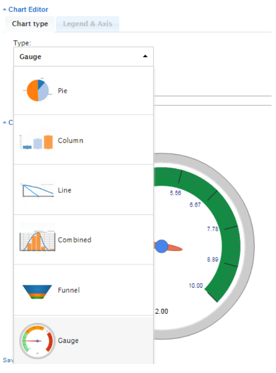
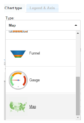
In the Chart Editor Type selection you can pick the necessary chart type: Pie, Column, Line, Combined (multi-axes), Funnel or Gauge chart:
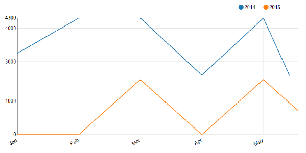
Pie Chart
If you have selected Pie chart Type, under the Legend & Axis tab you can choose Legend and Summary or Counted Value to be displayed by your chart. If you mark the Show percent (%) check-box, the percentage for each value will be shown next to it in brackets, as you can see in the example below.
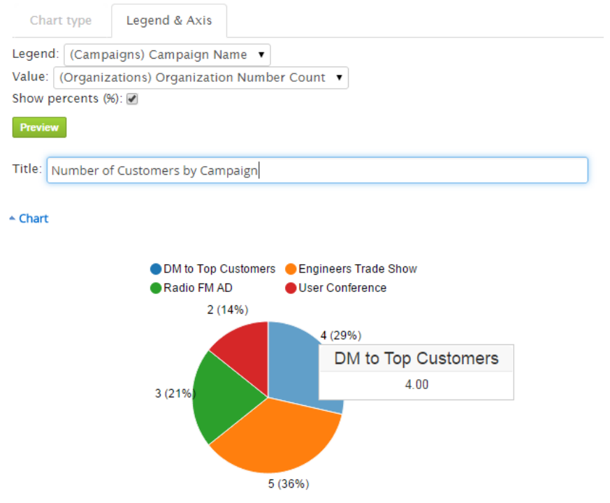
Hovering or clicking on any chart area will display the data represented by this area. Clicking the circles next to the Chart Legend will hide/show the corresponding data in the chart. It is important to Save the report if you want your new chart settings to be saved.
Column Chart
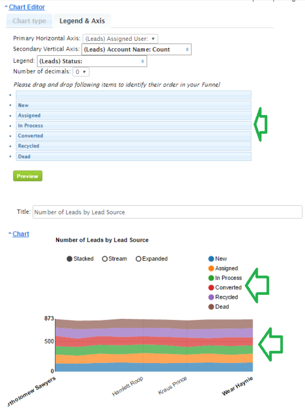
If you have selected the Column chart type, under Legend and Axis you can identify the group from your Report which should be represented by the Primary Horizontal Axis. The summary, count or average should be selected for the Secondary Vertical Axis. You can select more than one of the Summary Aggregates under Secondary Vertical Axis, in this case the Legend should be same as selected under Vertical Axis. Otherwise it can be any of the Groups from your report.
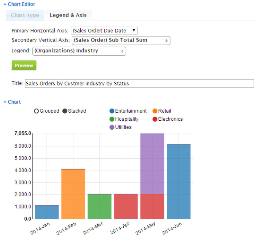
For Column chart you can select Grouped or Stacked data representation. Hovering or clicking on any chart area will display the data represented by this area. Clicking the circles next to the Chart Legend will hide/show the corresponding data in the chart. It is important to Save the report if you want your new chart settings to be saved.
Horizontal Bar Chart
If you have selected the Horizontal Bar chart type, under Legend and Axis you can identify the group from your Report which should be represented by the Primary Horizontal Axis. The summary, count or average should be selected for the Secondary Vertical Axis. You can select more than one of the Summary Aggregates under Secondary Vertical Axis, in this case the Legend should be same as selected under Secondary Vertical Axis. Otherwise it can be any of the Groups from your report.
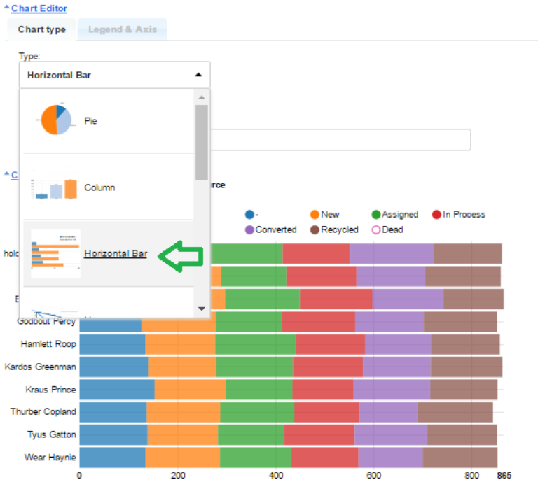
For Horizontal Bar chart you can select Grouped or Stacked data representation. Hovering or clicking on any chart area will display the data represented by this area. Clicking the circles next to the Chart Legend will hide/show the corresponding data in the chart. It is important to Save the report if you want your new chart settings to be saved.
Line Chart
If you have selected the Line chart type, under Legend and Axis you can identify the group from your Report which should be represented by the Primary Horizontal Axis. The summary, count or average should be selected for the Secondary Vertical Axis. You can select more than one of the Summary Aggregates under Secondary Vertical Axis, in this case the Legend should be same as selected under Vertical Axis. Otherwise it can be any of the Groups from your report.
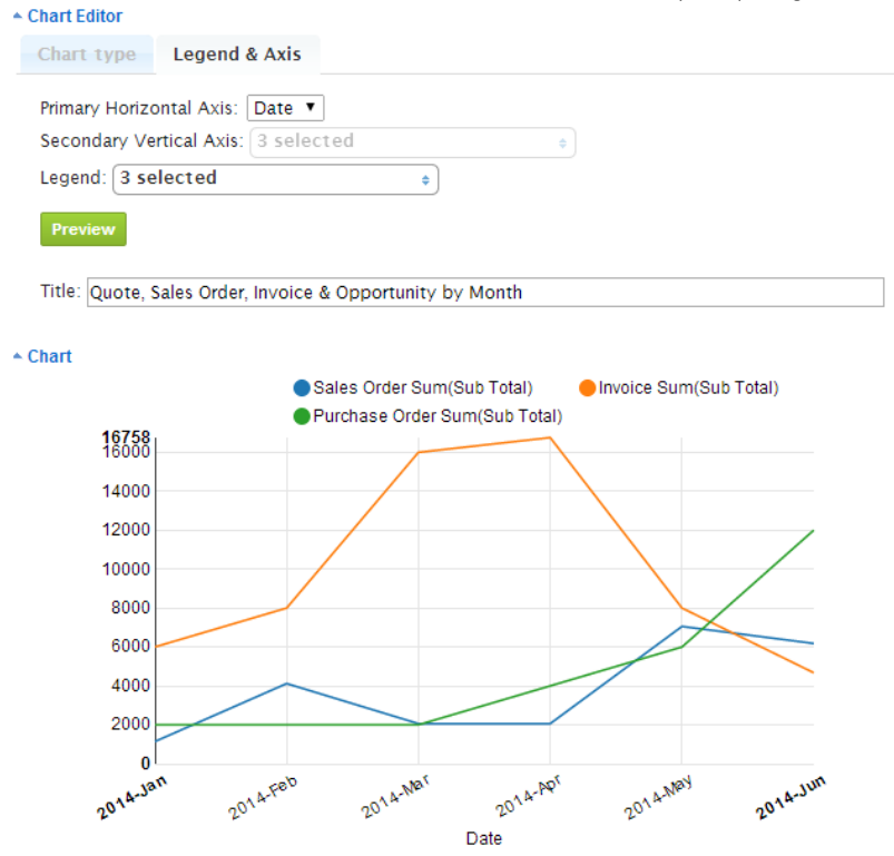
Hovering or clicking on any chart segment will display the data represented by this segment. Clicking the circles next to the Chart Legend will hide/show the corresponding data in the chart. It is important to Save the report if you want your new chart settings to be saved.
Area Chart
In order to select the new chart type Area Chart, please select the Area Chart type under Chart Settings:
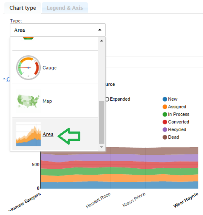
Under Legend & Axis you can now identify, what should be displayed in your Area Chart. The chart is using previously Saved Report settings (identified Aggregates under Aggregates tab and Groups under Grouping and Sorting tab).
When choosing Stacked and the selected Legend source is a pick-list type field, e.g. Status, you will be able to drag&drop the order of the values to be displayed in your Area chart.
Combined (Multi-Axis) Chart
The Combined chart has two Vertical Axes, which is important if you want to see differently scaled amounts in the same chart, for example, if you need to see Sales Order Sums and Count in the same chart, like in the picture below. In this chart all selected data can be represented as Line or as Column. The legend should then contain all those values, which are selected under both Vertical Axes. The group (which is date, status, name etc.) is recommended to be selected for the Horizontal axis.
In our example below we have Lines representing Count on the Secondary vertical axis (Quote, Sales Order and Invoice Count), and Columns representing Sums on the Third Vertical Axis (Sum of Quote, Sales Order and Invoice Sub total).
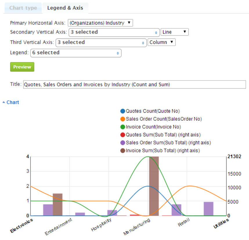
Hovering or clicking on any chart area will display the data represented by this area. Clicking the circles next to the Chart Legend will hide/show the corresponding data in the chart. It is important to Save the report if you want your new chart settings to be saved.
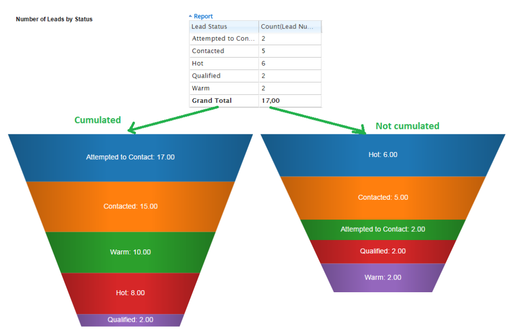
Funnel Chart
After you have selected the Funnel chart type, under Legend and Axis, you can choose to have the values accumulated in the Funnel chart or not. Select Grouped Item and then Value to be displayed on the Funnel. If you have selected the Cumulated check-box, you will be able to identify the item order to be displayed in your Funnel Chart. All available Items will appear below and you can re-order them by drag and drop.
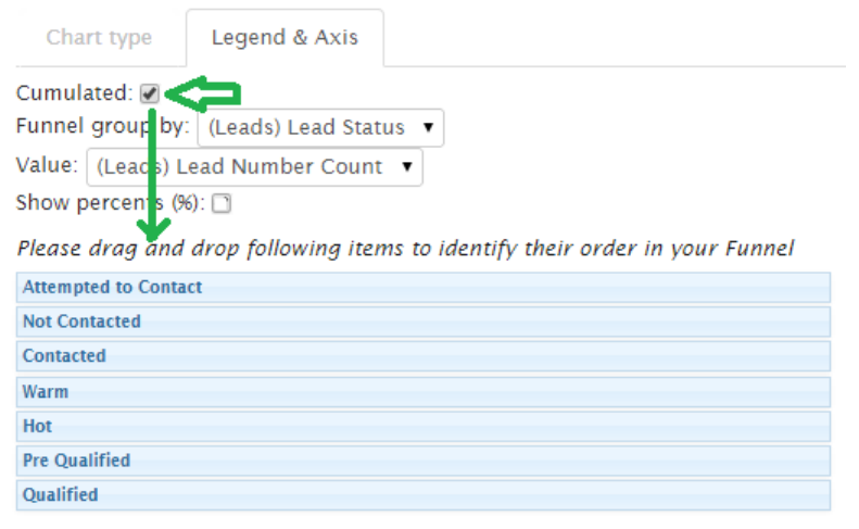
If you don’t want to cumulate values in the chart, you need to deselect the Cumulated check-box. In this case you will not be able to identify the Item order in the Funnel manually, as it will be sorted automatically in Descending order (from the largest amount to the smallest).
Note the difference in the example below:
If you mark the check-box near Show percent (%), the calculated % for each value will be shown next to the value in brackets.
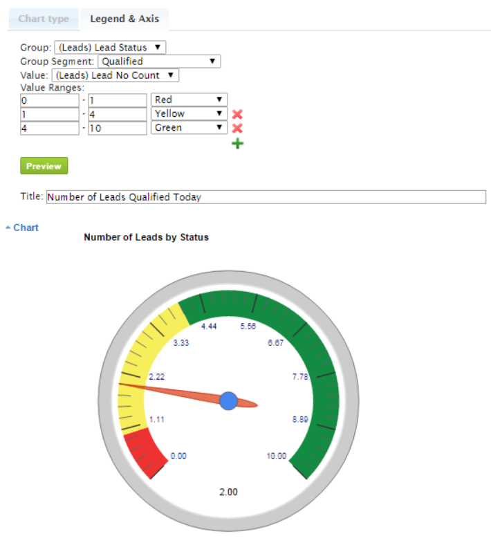
Gauge (Dial) Chart
After you have selected Gauge chart type, under Legend and Axis, you can select one of the Groups and then the Segment (Item) of this Group, then summarized, averaged or counted Value to be displayed in your Gauge chart. If you select All under Grouped Segment, then Gauge will show the grand total value. For example, if you only want to see, how many Leads with the Qualified status there are, you need to select Lead Status for the Group and Qualified – for Group Segment, then Lead No Count for the value. In the example below you can see how it would look.
Before that, you need to identify the ranges and their colors for your Gauge. In our example Qualified lead numbers between 0 and 1 will be in a red colored area; between 1 and 4 – yellow and the best values between 4 and 10 will be green. The arrow in the Dial will point to the value, which you can see at the bottom as well – it is 2 in our case.
GEOGRAPHIC (MAP) CHART
Selecting Countries and States for Geographic Chart
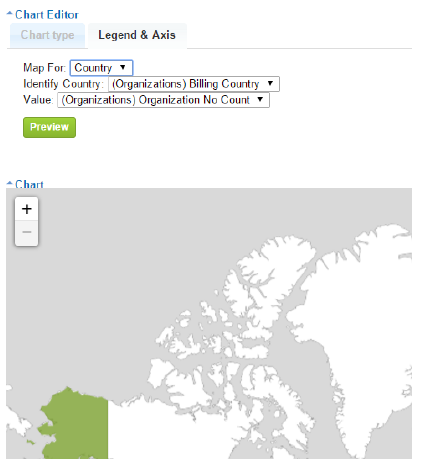
Under Chart Editor the selection of Map chart type is now available.
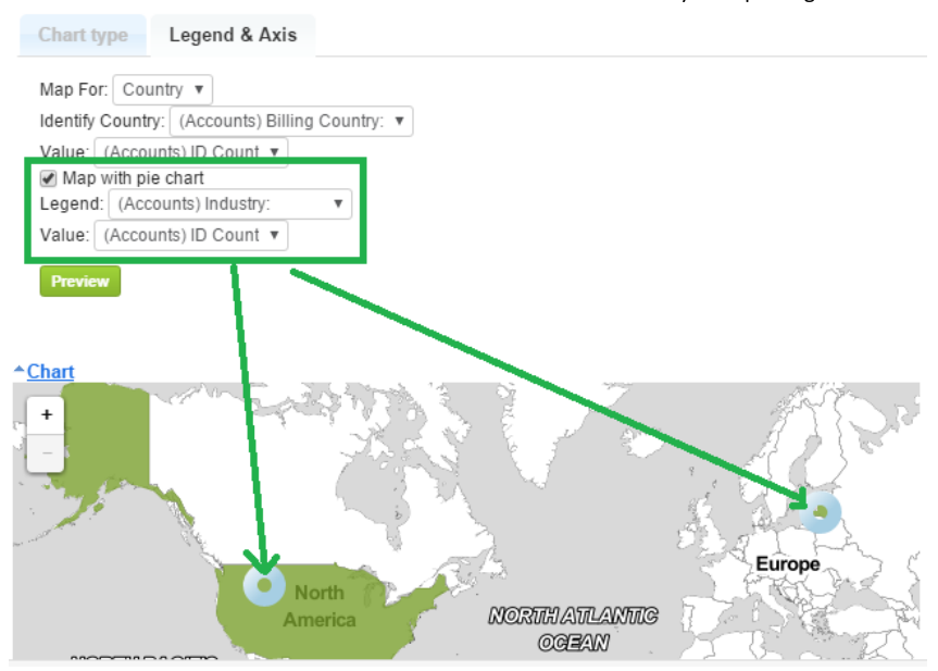
Currently the Map Chart is available for data representing either Countries or States. Under Legend & Axis in Map for: please select whether you need to see the chart representing Countries or just States.
Under Identify Country – please select the report column, which contains country or state names. Under Value please identify the summary column with values that should be represented in the chart.
In addition, you can add one more dimension to be displayed in your Geographic chart. For example, it can be customer industry by country. If this is necessary, please select Map with pie chart check-box and then identify the dimension field name as you can see in the sample below.
If the chart doesn’t fit, you can use Chart size and Chart height to increase / decrease its size. As always, please remember to Save the added or modified Chart settings.
Selecting Cities for Geographic Chart
Geographic charts are a great way to visualize your data! Besides Country and State you can now also show data on Cities.
We are constantly extending the list of supported Countries for the Geographic chart. Please email us at info@itsapiens to inquire about specific Country support and we will add support for Cities in that Country in case it is currently unsupported.
To create a Geographic chart with Cities you will need a report that has Grouping by Country and City and some cases also State/Province for disambiguation.
In our example we will create a Geographic Chart to display Accounts by Industry on a City to City basis. Our grouping options are as follows:
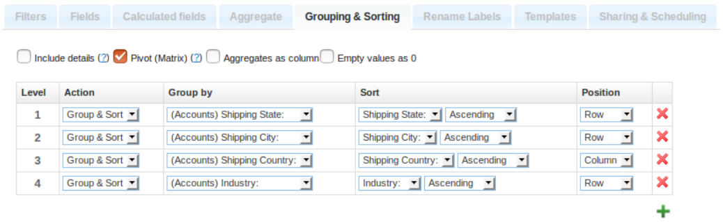
We have grouped our report by Country, State and City. We have also grouped and aggregated the count of our field of interest – Industry. The report is ready at this point but you might also want to change other Report options like Filters.
We select the Geographic Chart type and under Legend & Axis we set all the options and fields to match our report. Match the Country, State and City fields and identify the value which will be displayed on the density-colored Map Markers.
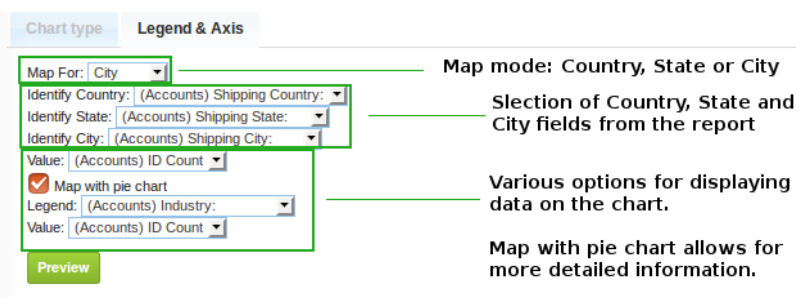
The Map with Pie chart adds a small Pie Chart on top of the Regular Map Marker with a more detailed breakdown of the data. You can display different values for the regular markers and the Pie Chart.
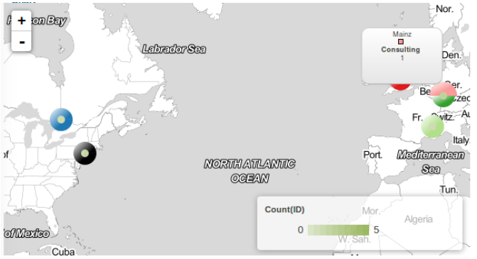
Regular Map Markers are heat colored for better visibility of low density regions. Adding Pie Charts changes the coloring to a green shaded scale for less color clutter.
As an end result we get all our data beautifully displayed on the Geographic Chart with great visual insights and flexibility.
Yearly Comparison by Quarter/Month/Week for Charts
Analytic Reporting Tool allows you to have more than one date dimension for the same date field in the same report. It is available for both: the report table and the chart. For example, if you need to compare the monthly pipeline of 2015 versus 2014, under Grouping & Sorting you need to select the same date field twice. In Group by you should select date + Year for one and then date Month for the other, like in the example below:
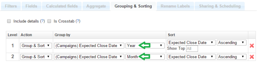
After saving these options you can now identify the Year for the Label and Month for the Horizontal Axis. Our example might look something like this.
Adding a Chart to the Homepage Dashlets
When the report is open, you can add the chart to your Home Dashlets. Click the Add to Homepage link to add this chart to your CRM system Homepage Dashlets.
If you are an Admin user or report owner, you can also add the chart to other user’s home dashlets. You can either add it to all users within a selected role, or a specific user. After clicking Add to Homepage, the current chart will be added to the dashlet according to your options.
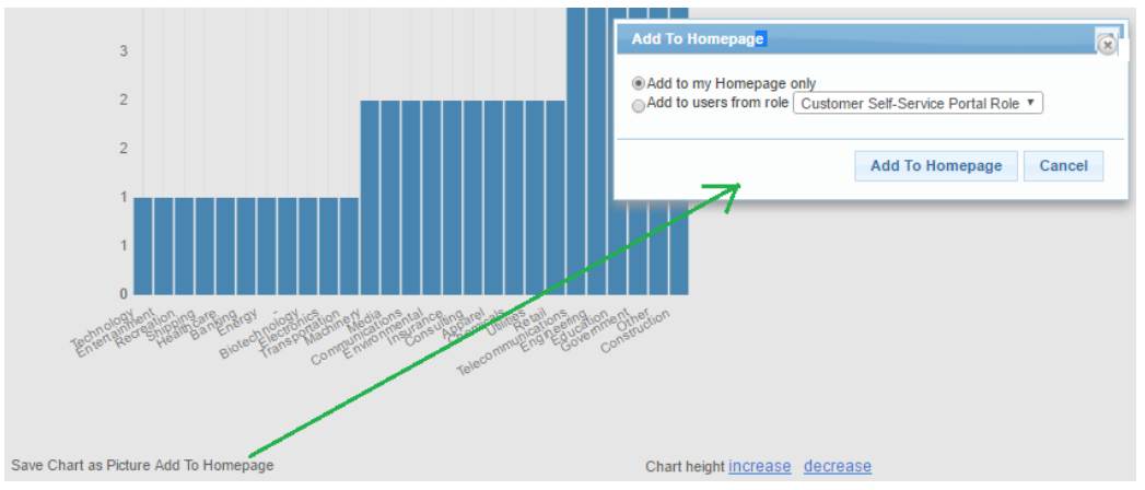
After a pop-up confirmation the Chart and its Title will appear in your CRM system Homepage Dashlet:
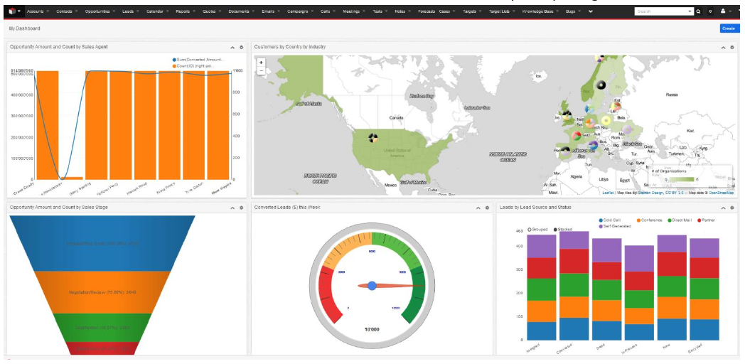
On the Homepage charts are still interactive (i.e. displays the information on mouse-over represented by the area, can hide/show by clicking on the legend, etc.).
Clicking the Chart Title link inside the Homepage Chart Dashlet will open the corresponding Report and Chart.
Changed and saved Report or Chart settings will apply to charts in the Homepage Dashlet as well.